Your website is like a silent salesperson. If it doesn’t do its job right, it’s costing you money, leads, and trust. Many entrepreneurs unknowingly make simple mistakes that hold back their growth. The good news? Fixing these errors is easier than you think. With the right tweaks, your website can become a powerful tool that attracts visitors and turns them into clients.
In this guide, you’ll discover the biggest website mistakes businesses make. Plus, I’ll share practical fixes, examples, and expert tips to help you turn your site into a sales machine.
Why Your Website Must Build Trust From the First Click
The First Impression Matters
People judge your website’s credibility within seconds. If it looks unprofessional or confusing, visitors leave — fast. A clean, high-end design signals that you are trustworthy. Think of your website as a handshake — the first chance to make a good impression.
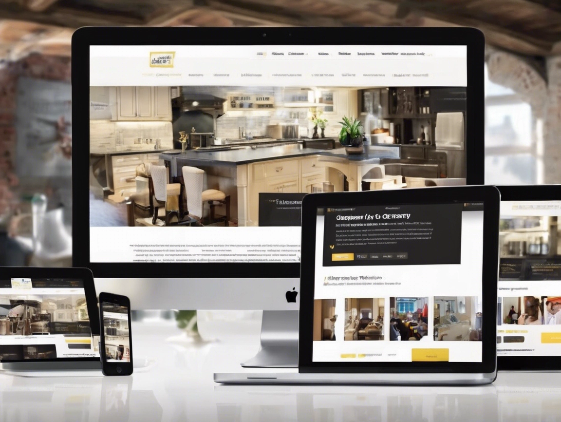
The Power of a High-Quality Look
A well-designed site suggests your business is reliable. This isn’t just about aesthetics. It’s based on a psychological trick called the halo effect, where a neat appearance makes everything else about your business seem better. When your site looks polished, people automatically trust your services more.
Quick Tip: Use consistent, quality visuals and a simple layout. This builds trust early and encourages visitors to stay longer.
Common Website Mistakes and How to Fix Them
Clarity in Messaging and Positioning
Nail the Hero Section
The hero section is the first thing visitors see. Its job is simple: tell them what you do, why it matters, and what they should do next. Yet many sites go wrong here.
Problems include:
- Vague headlines that confuse instead of clarify
- Focus on your business, not your customer
- No clear call to action (CTA)
Fix them with:
- Headlines that focus on benefits, like “Get a Brighter Smile in One Visit”
- Images that show happy, satisfied clients
- Strong, specific CTAs like “Book Your Free Consultation” or “Get Your Quote”
This way, visitors understand exactly what you offer and the next step to take.
Choosing and Using Better Imagery
- Use authentic, natural photos that look real
- Avoid cheesy stock photos that are overly staged
- Pick images that match your brand’s style and vibe
- Make sure high-resolution images load fast
Photos showing real moments help visitors connect emotionally and trust you more.
Keep Visuals Consistent
- Choose images with the same look and feel
- Stick to a color palette that feels cohesive
- Use images with the same style, brightness, and energy
This makes your site look professional and unified.
Structuring Content to Catch Attention
- Use specific, benefits-driven headlines
- Write for skimmers — bold headers and short paragraphs
- Tell a complete story: problem, solution, benefits, social proof, call to action
- Keep your message simple and direct
Visitors scan websites. Your goal is to give them what they want quickly.
Effective Calls to Action
- Use clear, specific words like “Schedule Now” or “Get Your Free Quote”
- Avoid vague CTAs like “Learn More”
- Make buttons bold and contrasting, so they stand out
- Repeat your CTA in different spots on the page
- Keep each button’s style consistent
Clear, noticeable CTAs guide visitors to take action easily.
Design for Simplicity
- Stick to familiar layouts your audience expects
- Use whitespace to give eyes a break
- Limit unnecessary images and words
- Follow proven design patterns in your industry
Simple sites look nicer, feel trustworthy, and prevent overwhelm.
Add Personal and Unique Touches
- Use your brand colors, fonts, and style
- Incorporate interactive features like quizzes or videos
- Share a short Founder’s note to build connection
These small creative elements stand out within standard layouts, making your website memorable.
Pitfalls That Push Customers Away
Vague, Unspecific Content
Claims like “Customer satisfaction is our priority” are overused. Be precise with real benefits and results. Share numbers or specific outcomes, such as “95% of clients see brighter teeth after their first visit.”
Underusing Testimonials
People want proof. Instead of long, boring reviews, pick short, punchy quotes with photos. Highlight results that matter, like “Helped me lose 20 pounds in 3 months.”
Lack of Clear Pricing
Be upfront about your packages or service ranges. Don’t make visitors guess what they will pay. Even if you do custom quotes, give general info to reduce hesitation.
Confusing or Conflicting Calls to Action
Don’t use several buttons with different messages. Stick to one clear CTA like “Book Your Free Call” and place it prominently. Repeat it across your pages so visitors always see the next step.
Outdated or Overly Complex Layouts
Avoid cluttered, complicated designs. Use familiar, simple structures. Stick to the usual layout with a big hero image, benefits, process, and testimonials. Visitors expect this and trust it.
How to Tweak Your Website Without Spending a Fortune
- Use free stock photos that look natural (sites like Unsplash or Pexels)
- Use affordable website builders like Squarespace or Wix
- Write clear, benefit-focused content using simple templates or AI tools
- Focus on clarity over bells and whistles
- Hire professionals only for key areas like photography or major design fixes
Precise, simple changes can make a big difference.
Conclusion
Your website is a key driver of your business growth. Avoid common mistakes like confusing messaging, cluttered design, and vague calls to action. Instead, aim for clarity, trustworthiness, and simplicity. Use real images, tell a clear story, and guide visitors with strong, consistent CTAs. Small tweaks can skyrocket your traffic, leads, and sales.
Start by examining your own site with fresh eyes—then implement these proven fixes today. With the right approach, your website will stop sabotaging your success and start driving business nonstop.